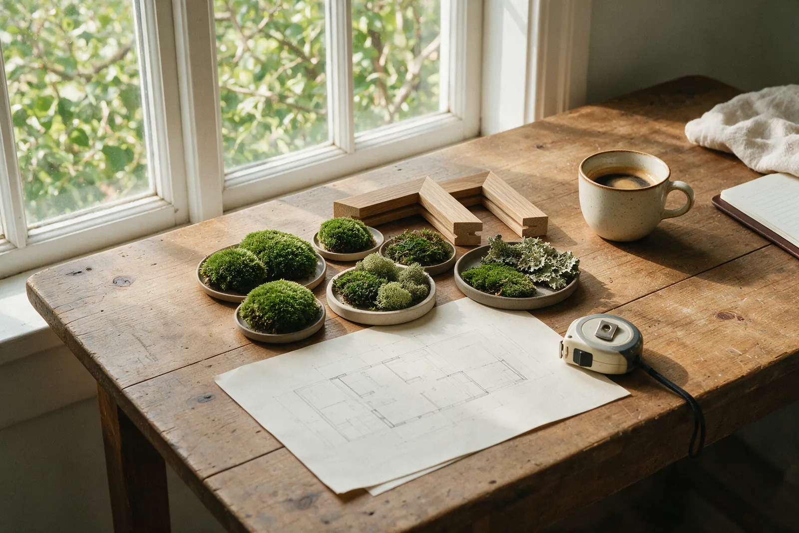
In 2014, the New York consultancy Terrapin Bright Green published 14 Patterns of Biophilic Design, a 60-page paper by William Browning, Catherine Ryan and Joseph Clancy. Since then it has become the industry’s practical reference: it appears in architecture briefs, in the guidance of the WELL standard and in the training of interior designers. Its great merit is having turned an intuition (“nature feels good”) into a catalogue of concrete design decisions, each backed by studies in environmental psychology, neuroscience and health.
In this article we go through the 14 patterns one by one, with the evidence that supports them and an example of how each takes shape in a real space. If you have not yet read what biophilic design is, start there.
Group 1: nature in the space
These are the seven patterns of direct presence. It is the group with the most evidence and, in general, the one that produces the fastest physiological responses.
1. Visual connection with nature
Seeing plants, water, landscape or any living element. It is the most studied pattern: the evidence links views of nature to lower blood pressure and heart rate, and to better attention recovery. In a project it means windows facing green, indoor gardens or, when there is no outdoors available, walls and artworks of real vegetation at eye level.
2. Non-visual connection with nature
Natural sounds, smells and textures: the murmur of water, the scent of wood or soil, the touch of an organic surface. Studies on water sounds and birdsong show stress reductions similar to those of views.
3. Non-rhythmic sensory stimuli
Small unpredictable variations: leaves moving in the air, shifting shadows, a passing cloud. They hold soft attention without tiring it. This is the pattern that explains why a plant by a window relaxes more than a photograph of the same plant.
4. Thermal and airflow variability
Gentle drafts, slight changes in temperature and humidity, as under the shade of a tree. Spaces with monotonous air feel “dead”.
5. Presence of water
Seeing, hearing or touching water. It reduces stress and improves the perceived quality of a space. A small sheet of water in a lobby has more effect than its size suggests.
6. Dynamic and diffuse light
Light that changes in intensity and angle through the day, with soft shadows. It regulates circadian rhythms and avoids the visual fatigue of flat light.
7. Connection with natural systems
Perceiving nature’s processes: the passing seasons, growth, the water cycle. It creates a sense of belonging to something larger.
Group 2: natural analogues
Three patterns of indirect presence. These are what make it possible to make a space biophilic without windows or living plants.
8. Biomorphic forms and patterns
Curves, branching, geometries that recall shells, leaves, honeycombs. The eye processes them with less effort than pure straight lines. A moss mural with an organic composition is a direct example.
9. Material connection with nature
Wood, stone, cork, linen, wool, moss. Materials that reflect the local ecology and age visibly. Research on wood in interiors (for instance David Fell’s work in Canada) shows lower sympathetic nervous-system activation in rooms with wooden surfaces.
10. Complexity and order
Rich information with a recognisable structure, like a forest or a coastline. Physicist Richard Taylor has measured that mid-range fractal patterns (dimension between 1.3 and 1.5) are the ones that reduce stress most. A moss artwork with hundreds of pieces in different greens and a clear composition fits that description exactly.
Group 3: nature of the space
Four patterns about how space is configured. They come from our heritage as a species that needed to see and to shelter.
11. Prospect
Wide, unobstructed views into the distance. It reduces the feeling of vulnerability. In a reception, it means whoever enters can see the far end of the space.
12. Refuge
A protected spot, with a back and a low ceiling, from which to observe. Alcove seating in a restaurant or a bench under a mural are refuges.
13. Mystery
The promise of something beyond: a corridor that turns, a light glimpsed around a corner. It invites exploration. It is the favourite pattern of well-designed hotels.
14. Risk/peril
A safe thrill: a balcony over a void, a glass floor, a walkway. It engages attention without real threat.
How it translates into a real project
Nobody meets all 14 patterns at once, nor should they try. The Terrapin paper insists on prioritising according to the use of the space and the health goals being pursued. Some examples:
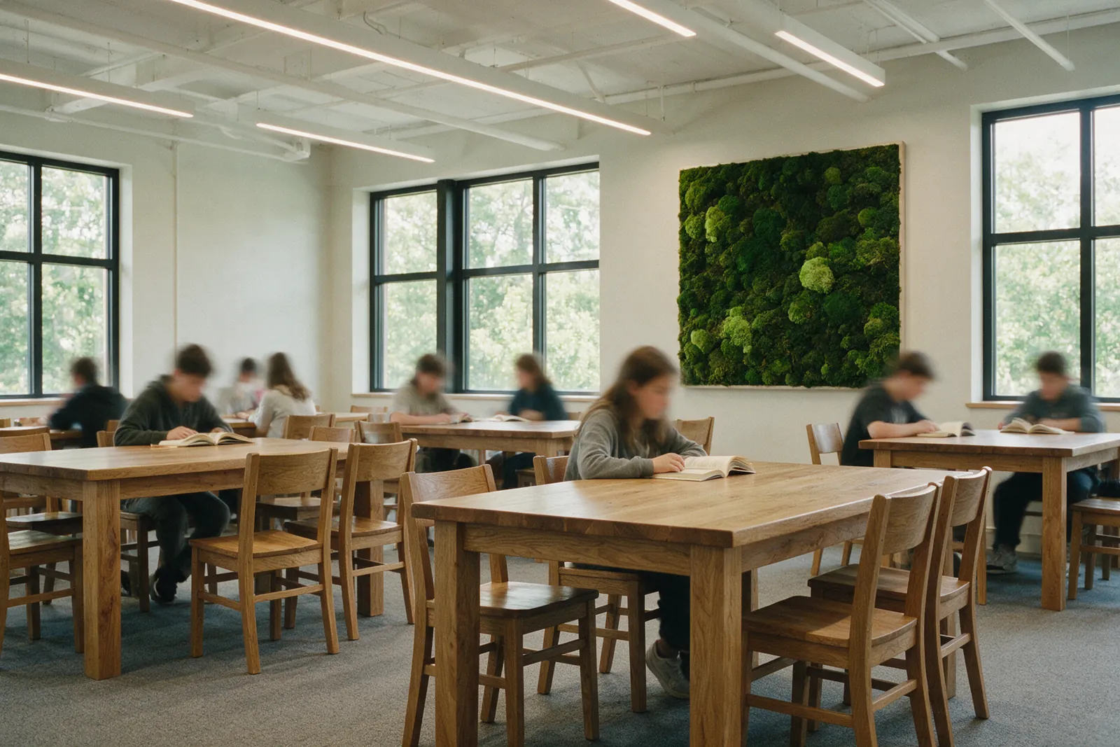
- Meeting room. Visual connection (1), natural materials (9), refuge (12). A moss mural on the front wall, a wooden table, warm side lighting.
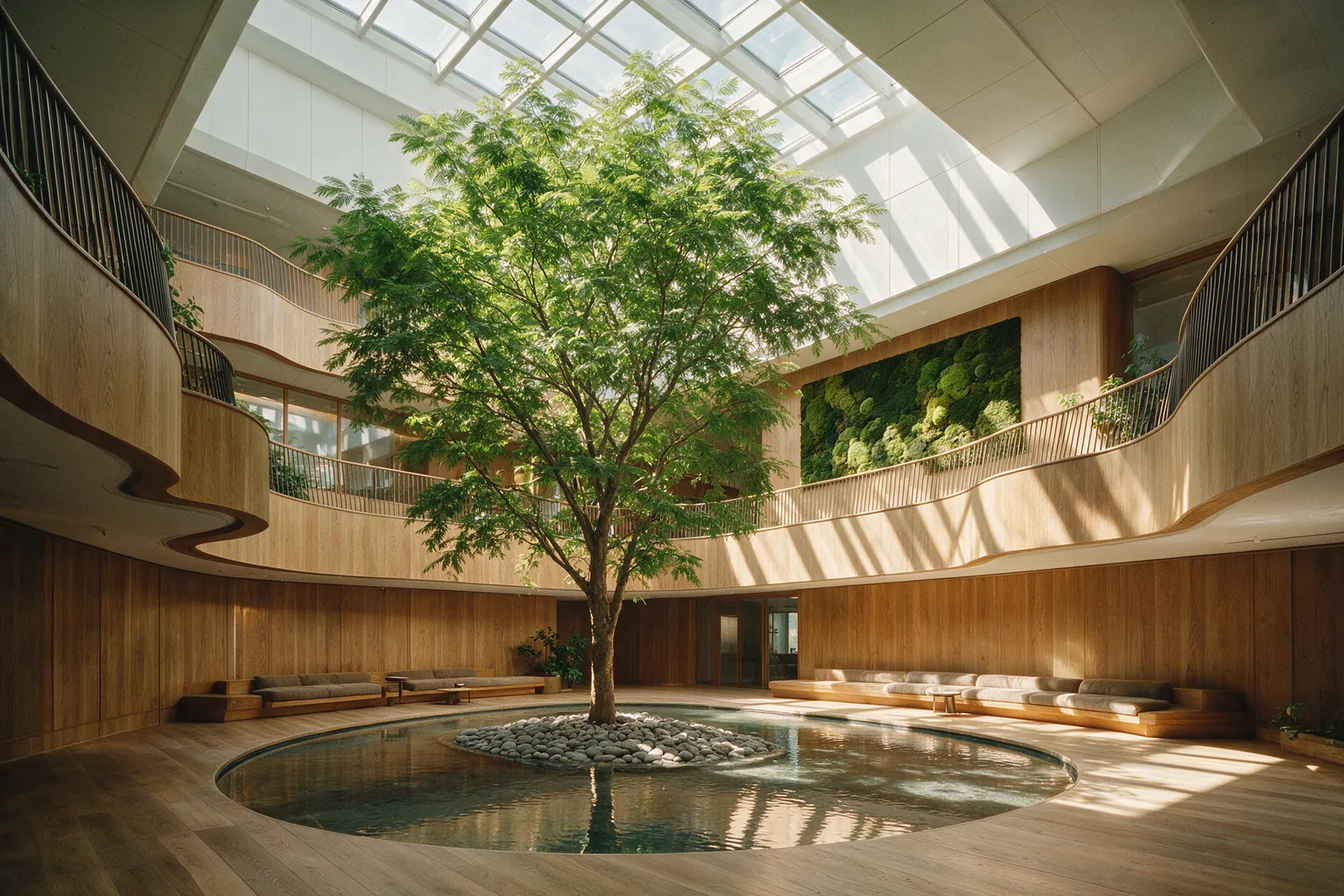
- Hotel or clinic reception. Visual connection (1), complexity and order (10), prospect (11), mystery (13). A large format opposite the entrance and a route that reveals something green at the far end.
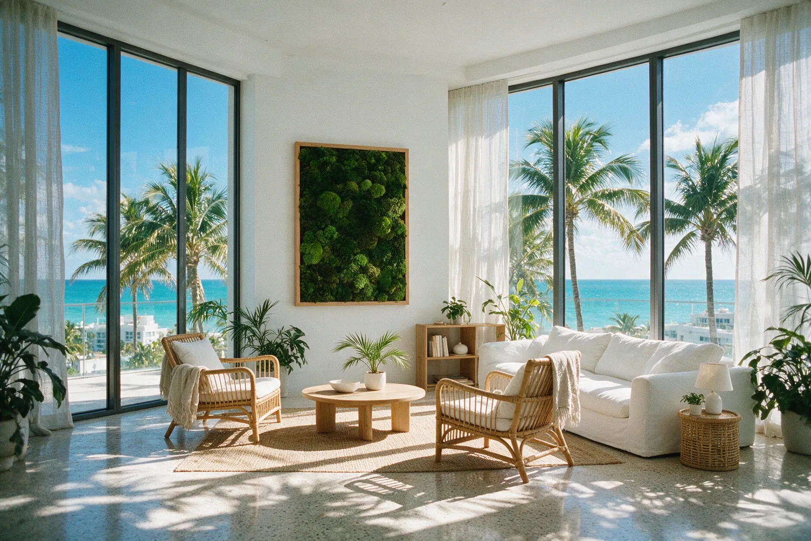
- Living room. Dynamic light (6), materials (9), visual connection (1). Filtering curtains, wood and linen, and a piece of real nature opposite the sofa.
A single preserved moss and lichen mural placed with judgement activates pattern 1 (it is real vegetation), 9 (organic material), 10 (fractal complexity with order) and, if placed opposite the entrance, 11. Four patterns in one decision. That is the logic behind the large formats made to order at The Pots.
Which patterns have the strongest evidence
Terrapin rates the strength of evidence for each pattern. Those with the most peer-reviewed studies are visual connection with nature (1), non-visual connection (2), presence of water (5), dynamic light (6), natural materials (9) and prospect and refuge (11 and 12). The rest rely on more recent or indirect research. It is a good guide for prioritising investment: if only one thing can be done, put real nature where people look.
Next week: the 1984 study that proved, with hospital data, that a window with trees shortens recovery.
Sources
- Browning, W. D., Ryan, C. O. and Clancy, J. O. (2014). 14 Patterns of Biophilic Design: Improving Health & Well-Being in the Built Environment. Terrapin Bright Green.
- Kellert, S. R. and Calabrese, E. (2015). The Practice of Biophilic Design.
- Taylor, R. P. (2006). Reduction of physiological stress using fractal art and architecture. Leonardo, 39(3), 245–251.
- Fell, D. R. (2010). Wood in the human environment: restorative properties of wood in the built indoor environment. Doctoral thesis, University of British Columbia.
Cited sources are peer-reviewed studies or public reports. The Pots is not involved in that research.